Nested Knowledge

Bringing Systematic Review to Life

User Tools

Site Tools


wiki:synthesis:quantitative

This is an old revision of the document!


Quantitative Synthesis

Quantitative Synthesis displays the results of a nest's extraction. Use this page to drill down on the outcomes of your research by Intervention or by study (Summary page), to see the distribution of results across individual studies (Distribution page), or view inferential statistics and forest plots for comparisons within your nest (NMA page).

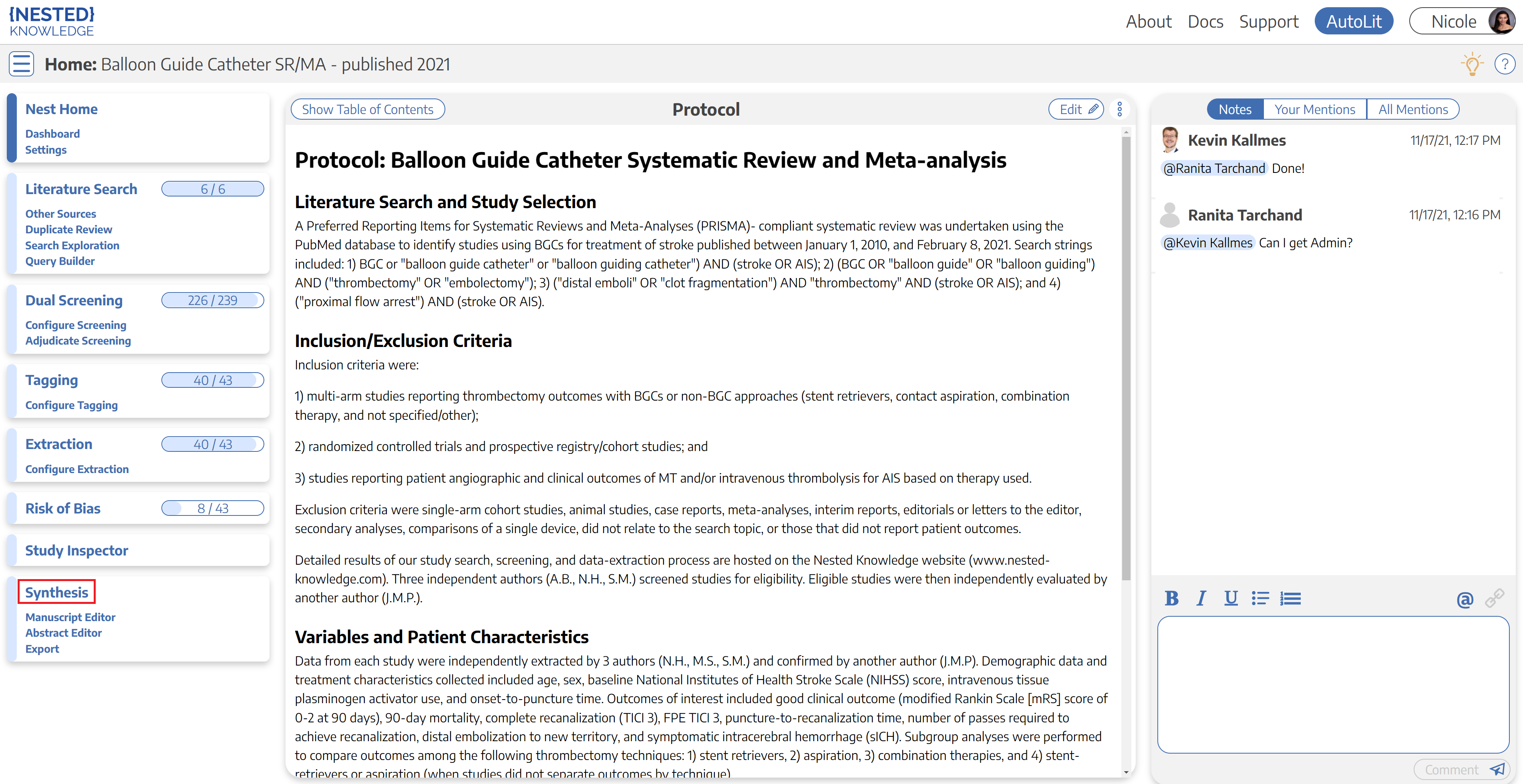
From the Nest menu, click on “Synthesis” in the left hand menu.

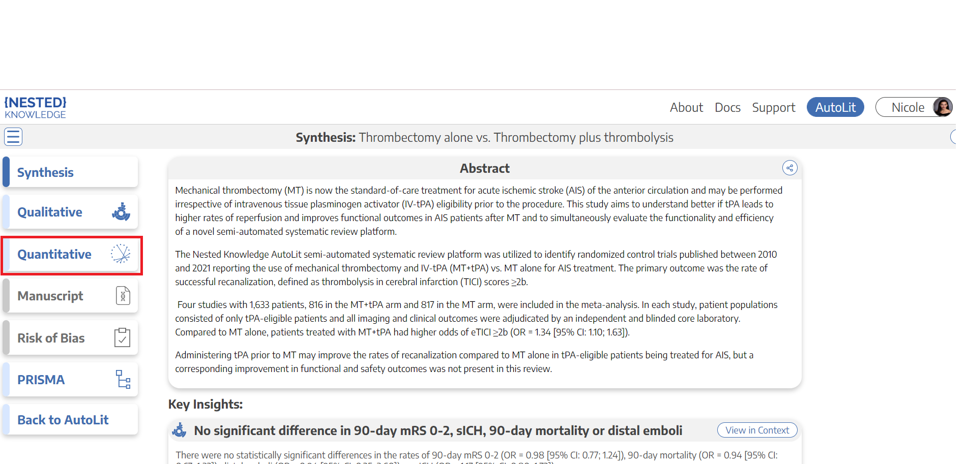
Then, from Synthesis Home, click on the “Quantitative Synthesis” section.

—-

2. Explore Summary

In the top-middle of the page “Summary” is automatically selected:

Default Summary View

In the Default View:

  • In the left column, Interventions are displayed down to the second level (that is, the nodes below the Root Node selected as Interventions).
  • In the other 3 columns, Data Elements are displayed, and the most commonly-reported Data Elements are shown by default. In the cells below, results are broken down into:
    • For Dichotomous variables, the event rate (n), total population (N), percentage (see Random/Fixed Effects), and a 95% Confidence Interval.
    • For Continuous variables, the mean/median, standard deviation (SD)/range/interquartile range (IQR), and a 95% Confidence Interval.
    • For Categorical variables, the event rate (n) for each category, as well as the total population (N) upon hovering.

Note: All Data Elements are classified as Baseline or Outcome during timepoint selection. The Data Element classification is displayed above each column upon selection.

From this Default View, you can manipulate the Interventions, Data Elements, and even statistic type to drill down on findings.

Random vs. Fixed Effects

  • Random/Fixed Effects: Across all Quantitative Synthesis pages, estimates and percentages displayed by Default are actually Random Effects calculations. To toggle to Fixed Effects (that is, an estimate based on an assumption of constancy or non-randomness), use the toggle in the upper right of the table.

Expand Interventions

Click on an Intervention of interest to expand down to see its children. This can be done recursively, meaning that if your top-level Interventions have multiple layers below them, each click will expand the next level down.

View Individual Underlying Studies

If there are no levels below a given Intervention, clicking on it will display the underlying studies and their associated Data Elements.

Choose Data Elements / Columns

To choose different Data Elements, click on the drop-down at the top of a column, view the list of all Data Elements (with a bar that represents data density, or the rate at which it was reported across studies), and select the Data Element of interest.


3. Explore Scatter Plot

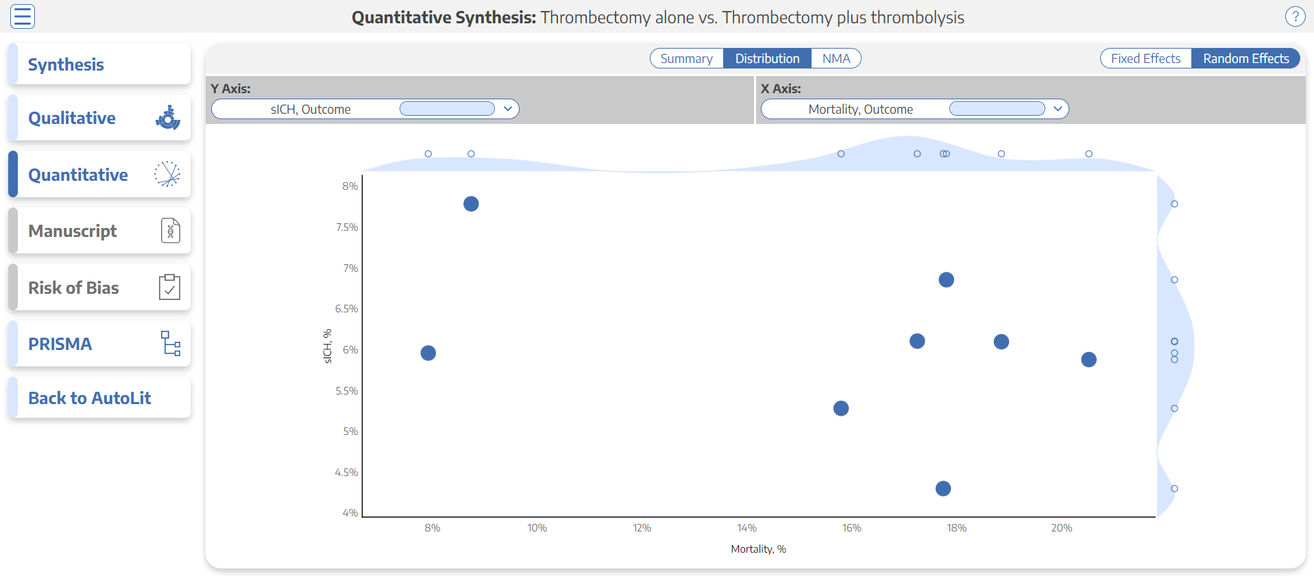
In the top-middle of the page Distribution” is highlighted. This page shows statistical relationships between Interventions and tags such as “sICH” and “Mortality” in a scatterplot formation.

In this page, select the X and Y axes to designate the Data Elements of interest. This will generate a chart that shows the distribution of studies based on their rate of each Data Element. Furthermore, hovering over any node in the Distribution page will show you the study the node represents, and clicking on it will open a study modal showing the abstract, data, tags, and search history of that study.

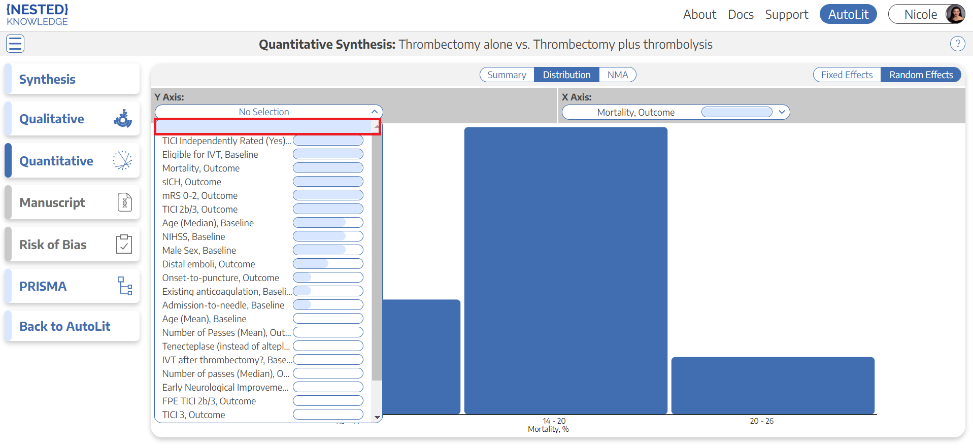
Histogram view: To view a histogram of findings for a single data element, go to the Y Axis selector, and click on the first option, which looks like a blank field. This will generate a histogram showing the distribution of findings across studies with respect to one, not two, data elements.


4. Explore NMA

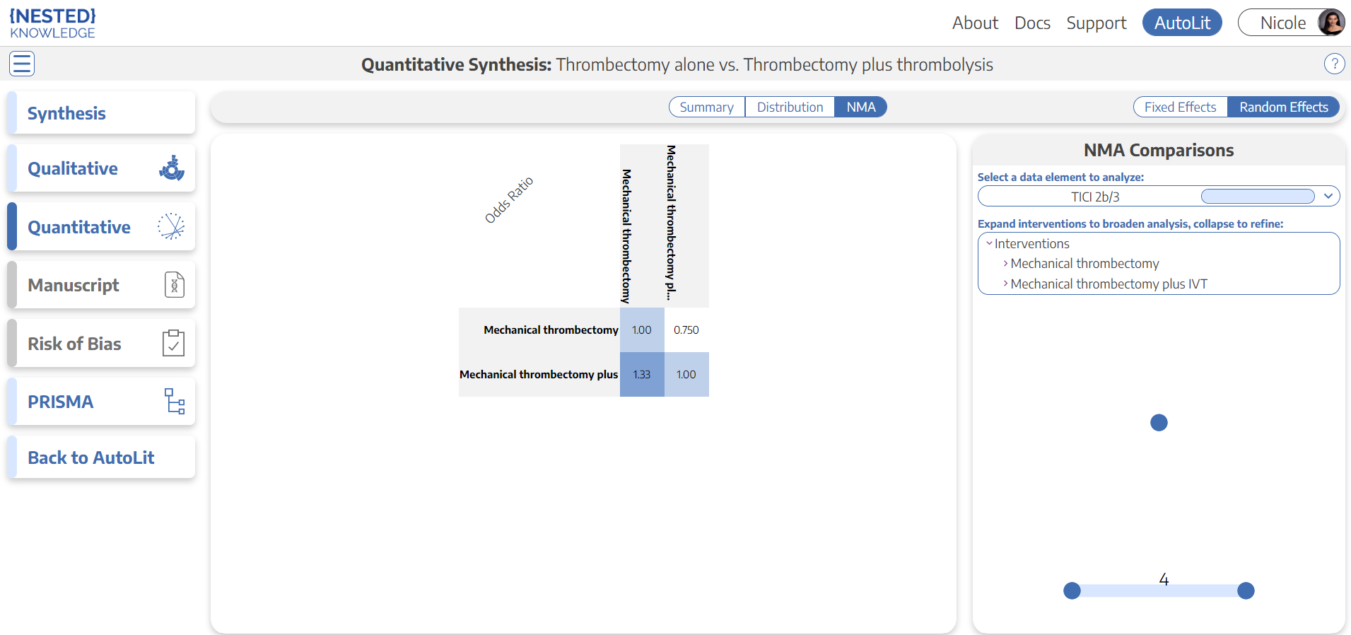
In the top-middle of the page, click “NMA”. The Network Meta-Analysis (NMA) allows you to explore Odds Ratios and Forest Plots from an automatically-generated model.

WARNING: The automatically-generated Network Meta-analysis uses generally accepted practices to calculate odds ratios and other outputs. However, you should use and interpret these findings with care:

  1. Comparative Studies Only: NMA depends on comparative evidence, meaning that the studies analyzed will only represent those with 2 or more Study Arms.
  2. Potential Bias: these outputs are only as trustworthy as the underlying studies. Any bias in the underlying studies will be carried through or even magnified by NMA, so completing an independent measure of heterogeneity and working to minimize bias are crucial steps, and even if followed, all NMA outputs should be interpreted with caution.

Default NMA

By default, your NMA page will show top-level Interventions (those just below the Root Node selected as your Interventions), compared with respect to the most-commonly-reported Data Element. This page will display:

Odd Ratio Chart

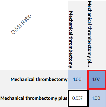
The Odds Ratio Chart shows all Interventions listed on both axes. The cells represent the odds ratio between the Intervention displayed in the row and the Intervention displayed in the column.

For instance, in the diagram below, the black box displays the odds of mortality for Mechanical Thrombectomy plus IV-tPA compared to Mechanical Thrombectomy alone (0.937 : 1), while the red box displays the odds of mortality for Mechanical Thrombectomy alone with respect to Mechanical Thrombectomy plus IV-tPA (1.07 : 1), or the inverse of the red box.

Selecting Data Elements and Interventions

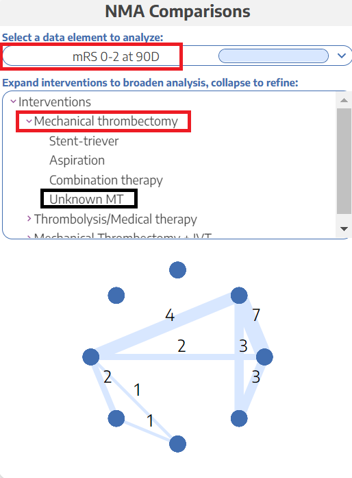
To select the Data Element you would like to show odds for, use the drop-down in the upper right, in the “NMA Comparisons” panel (red outline below).

To select the level of analysis for Interventions, use the listing below the Data Element drop-down. Like the first column of Summary, selecting an Intervention in this list (red box). will expand to display the next level down in the hierarchy of Interventions. When an Intervention is expanded down to the lowest level (black box), it will have no 'carat' indicating expandability and clicking will not change the selection.

Once you have selected your Intervention levels, the NMA Chart will display the number of studies comparing each of your Interventions of interest. Each node represents an Intervention (hover to see the Intervention title), and each line represents the number of studies comparing any two nodes.

SUCRA & Forest Plot of Interventions

Clicking on any Row or Column will create a SUCRA ranking, which displays Interventions in order based on their odds of achieving a given outcome. So, if high odds represent patient benefit, the 1st Intervention in the ranking represents a preliminary estimate of where that Intervention ranks in terms of patient benefit.

This will be supported by a Forest Plot displaying the Odds Ratio and a 95% Confidence Interval for the Intervention chosen compared to all other Interventions in the Odds Ratio Chart.

Forest Plot of Underlying Studies

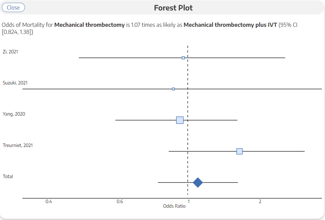
Clicking on any cell will create a Forest Plot for the specific comparison represented by that cell. It will display the Odds Ratio and a 95% Confidence Interval for all underlying studies reporting the two Interventions being compared, as well as a cumulative Odds Ratio and 95% Confidence Interval.

The cumulative Odds Ratio and 95% Confidence Interval will also be listed at the top of the page.

Calculation Methods for Quantitative Synthesis

To see how statistics are calculated for Quantitative Synthesis, including for the NMA, see here.

wiki/synthesis/quantitative.1668927444.txt.gz · Last modified: 2022/11/20 06:57 by nicole_hardy_alumni.brown.edu