AutoLit® User Guide
Examining Results in Synthesis
Administrative Tools
Support and FAQs
Best Nest Building Practices
SLR Basics: How to Perform Systematic Review
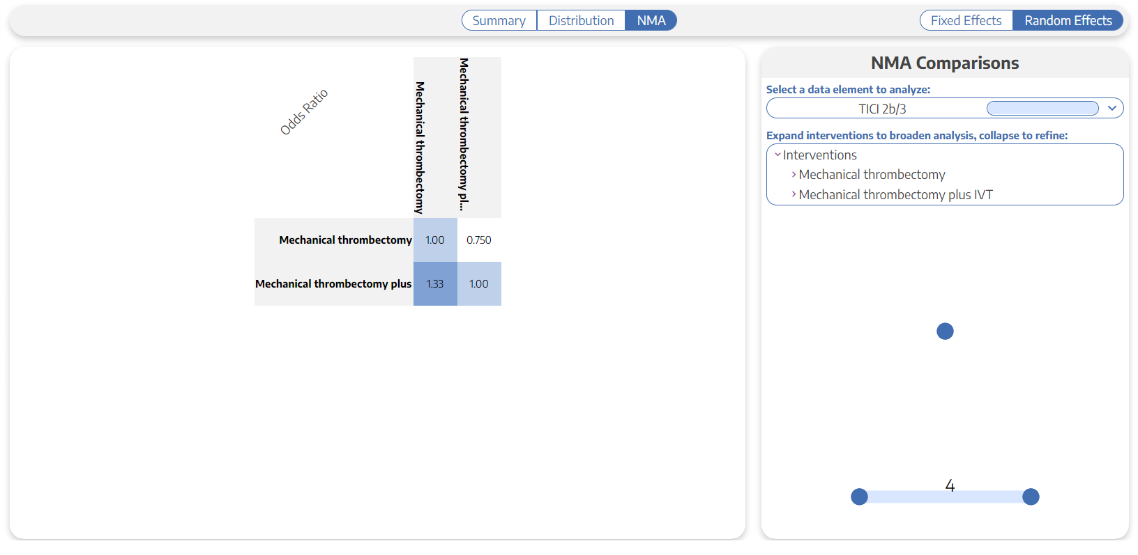
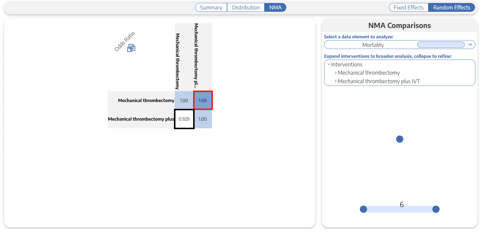
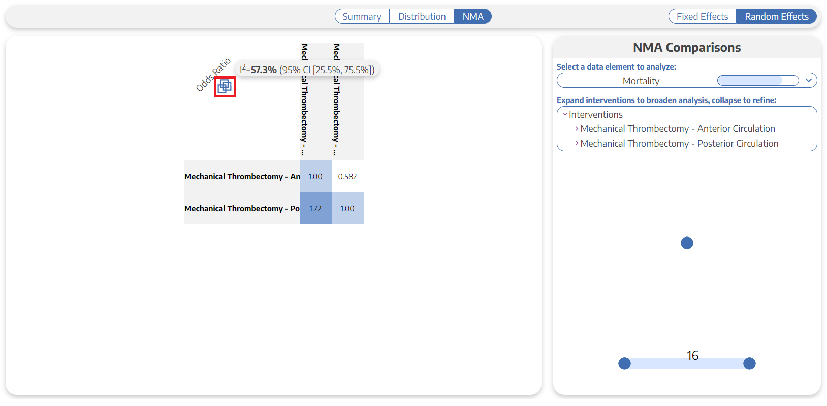
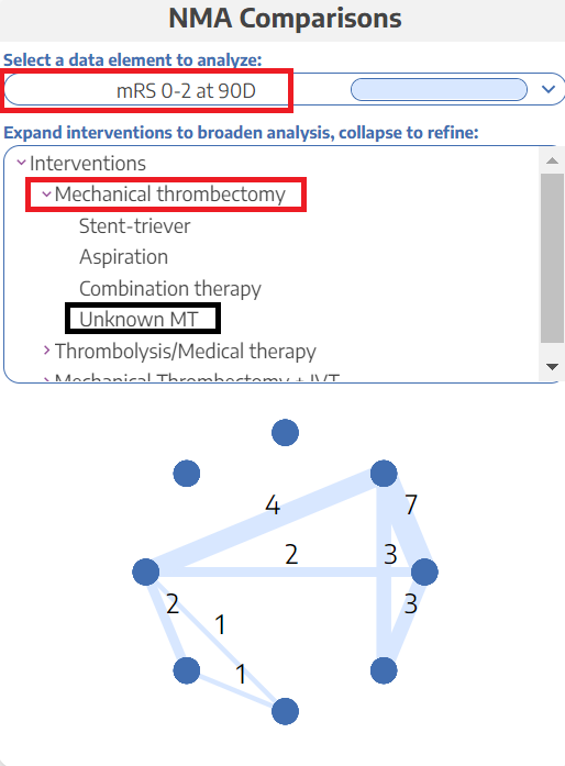
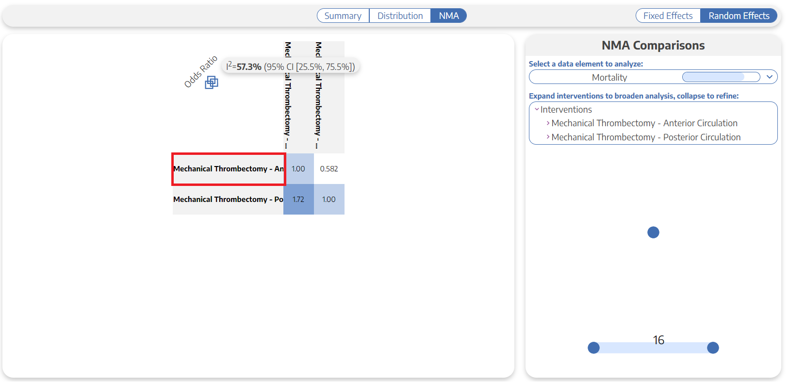
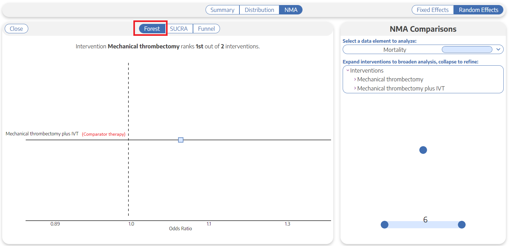
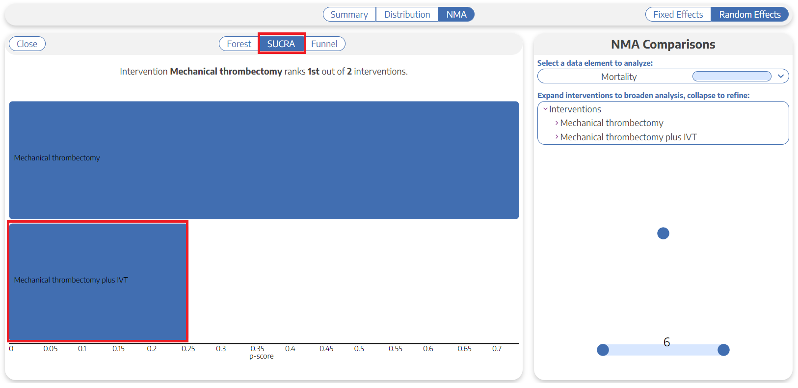
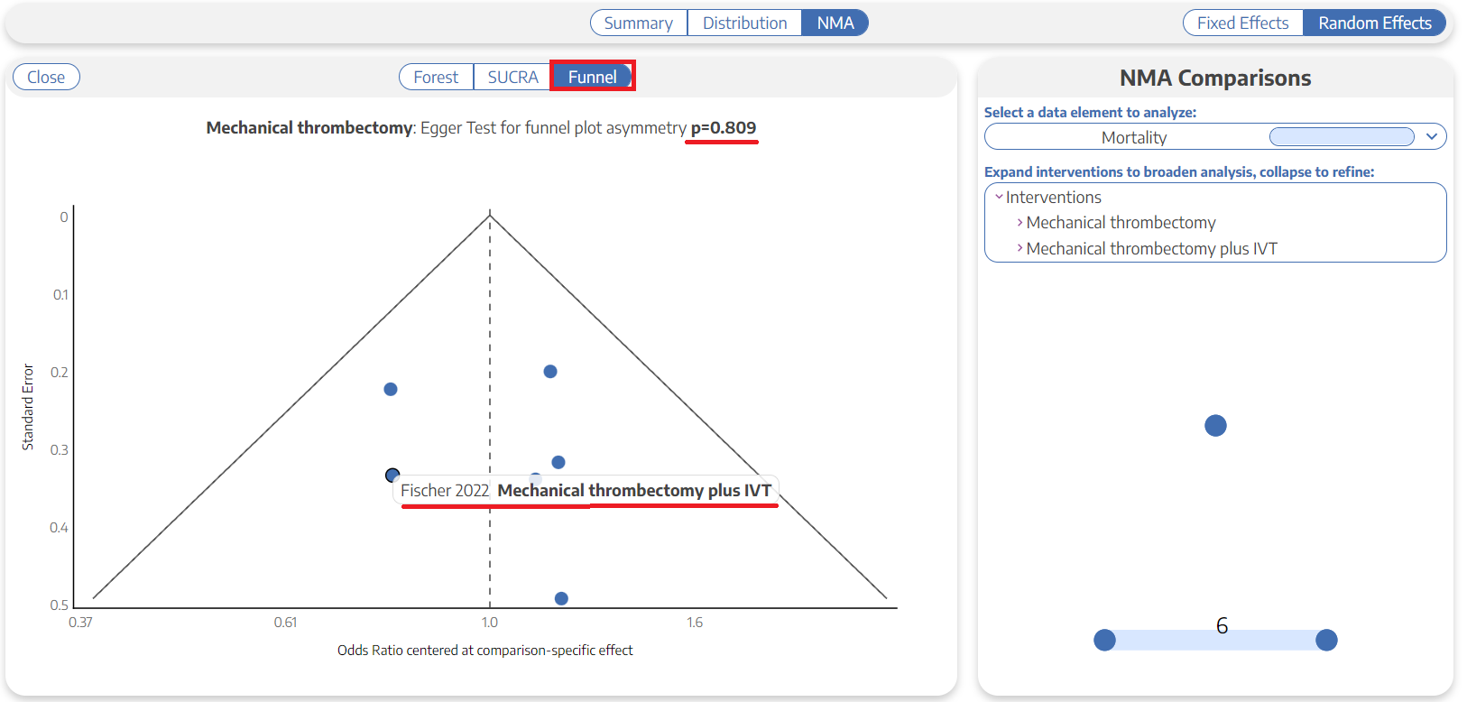
NMA Basics: How to Perform a Meta-Analysis
Best Practices for Writing a Publishable Manuscript